
Nowadays, it seems that every move we take creates a huge amount of information. While phrases like “big data” have lost their lustre, the data itself has not. When it comes to understanding, processing, analysing, and communicating this data, the traditional methods won’t cut it. No matter how big or curved your screen is, the CSV you exported into Excel is too much for anyone to comprehend.
Effective visualisations can help us accomplish more in less time. They also help us explain what we do to consumers, managers, and other employees.
This blog gives a general introduction of data visualisations, explains the value of its applications, and explains how to start a project utilising data visualisations. Also, offers a summary of data visualisations and their rationale.
Data Visualizations
The graphical presentation of a set of data is known as data visualisation. These graphical representations can take many different forms, including different sizes. Simple bar, column, line, and pie charts, dashboards with numerous connected graphs, and custom visualisations are some examples. Each chart type has its own set of benefits and drawbacks. Similar to how different charts are suitable for different types of data.
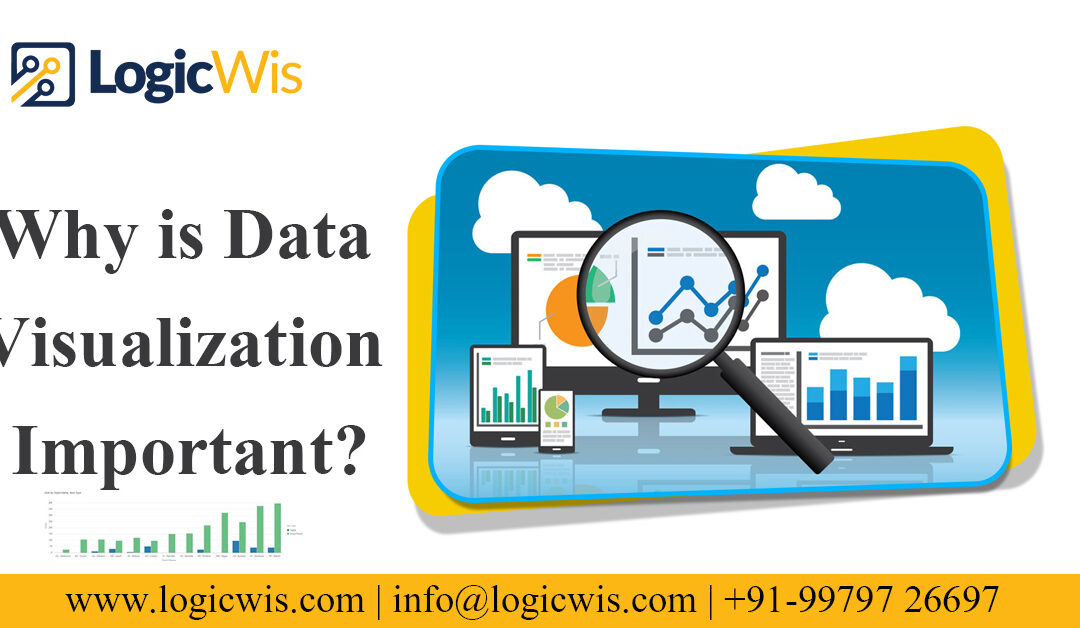
Data visualisation: Why Is It Important?
It is challenging to overstate the importance of data visualisation. People are visual beings. Exactly that is what data visualisation accomplishes. By employing human senses and cognition, it enhances comprehension. Visualizations are made possible by the ability of humans to notice changes in size, shape, location, quantity, and colour.
Let’s use a tried-and-true method: fictitious sales data (for those who were hoping I’d use the Iris data set, it was too large to post on the internet). This information shows sales figures from two of a company’s locations. Although precise data is available, it is impossible to fully understand what is happening. To communicate it to others in our firm is considerably more challenging.
When you use visualisation to examine the same facts, the situation changes completely. A few important aspects are immediately apparent. There is a propensity for decline in both businesses till May. While Store 1 has not recovered, Store 2 has and is even moving upward. October was a happy outlier in both stores. Although we are unable to view actual sales data, once we have a good idea of what is going on, we can always return to the original data. Most importantly, we are able to communicate the information easily so that we can determine why it is happening, seize opportunities, and resolve issues with our coworkers. Take into account what transpires when you extrapolate smaller data sets.
In conclusion, data visualisations are important because they make it easier for people to process, assess, and exchange information.
The beginning of data visualisation
The simplest way to get started with data visualisation is to look at past renderings and do some research. Once you’ve done this, you should see that various visualisation types are used in predictable ways. You can start thinking about your data once you’ve laid this foundation.
Before choosing which sort of visualisation to employ, you must first take into account the type of data you have. Take into account the following examples of potential inquiries:
- Is the data ratio, nominal, ordinal, or interval?
- Is it a moment in time or a depiction of change over time?
- The total number of data points is what.
After giving these kinds of queries some thought, you should evaluate the setting.
- Do you use your imagination to learn or to study and understand knowledge?
- Whom will you show the visualisations to?
- Will you be able to describe and provide examples of what you mean?
- Do any data sets share any relationships?
Get in touch with Logicwis right away to discover more about data visualisations!
Request for a quote!!